In today’s fast-paced digital world, businesses rely heavily on applications to manage operations, analyze data, and improve user experience. At the heart of these applications lies one powerful component: core app dashboards. These dashboards act as centralized hubs that provide users with real-time insights, actionable data, and seamless control over various functions.
Whether you are building a business app, a SaaS platform, or an internal management system, understanding how to design and optimize dashboards is essential. This guide explores everything you need to know about core app dashboards, from their importance to design strategies and future trends.
What Are Core App Dashboards?
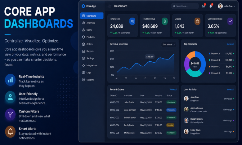
Core app dashboards are the main interface within an application where users can access key metrics, insights, and controls in one place. They serve as the command center of an app, allowing users to quickly understand performance, track progress, and make decisions.
These dashboards are designed to simplify complex data by presenting it visually through charts, graphs, and summaries. Instead of navigating multiple pages, users can get a comprehensive overview from a single screen. This improves efficiency and reduces the time needed to interpret information.
Another important aspect of dashboards is their adaptability. Depending on the user role, dashboards can display customized information. For example, an admin dashboard may show system analytics, while a user dashboard focuses on personal activity.
Moreover, dashboards enhance user engagement by making data more interactive. Features like filters, drill-down options, and real-time updates help users explore information in depth without leaving the interface.
Ultimately, core app dashboards are not just about data display—they are about empowering users to act quickly and confidently.
Key Features of Effective Core App Dashboards
Designing an effective dashboard requires more than just placing charts on a screen. It involves thoughtful planning and feature integration to ensure usability and clarity.
Real-Time Data Visualization
One of the most critical features of dashboards is real-time data updates. Users need accurate and up-to-date information to make informed decisions. Whether it’s tracking sales, monitoring system performance, or analyzing user behavior, real-time insights are essential.
Visual elements like bar charts, line graphs, and pie charts help users quickly grasp trends and patterns. These visuals reduce cognitive load and make complex data easier to understand.
Additionally, interactive visuals allow users to explore data further. For example, clicking on a chart can reveal detailed insights or filter results based on specific criteria.
Customization and Personalization
Not all users need the same information. Customizable dashboards allow users to tailor the interface according to their preferences and roles. This improves usability and ensures that users focus only on relevant data.
Users can often rearrange widgets, select preferred metrics, or change display settings. This flexibility enhances the overall user experience and increases productivity.
Personalization also includes saving user preferences, so the dashboard remains consistent across sessions. This reduces the need for repetitive adjustments.
User-Friendly Interface
A clean and intuitive interface is crucial for any dashboard. If users struggle to navigate the dashboard, it defeats its purpose. Simplicity should always be a priority.
Effective dashboards use clear labels, logical layouts, and consistent design patterns. Important information should be placed prominently, while secondary data can be positioned in less prominent areas.
Whitespace and visual hierarchy also play a significant role. They help guide the user’s attention and prevent the interface from feeling cluttered.
Integration with Other Tools
Modern applications rarely operate in isolation. Dashboards must integrate seamlessly with other tools and systems, such as CRM platforms, analytics tools, and databases.
Integration ensures that data flows smoothly between systems, providing a unified view. This eliminates the need for manual data entry and reduces errors.
APIs and third-party integrations make it easier to connect different services, enhancing the functionality of dashboards.
Benefits of Using Core App Dashboards
The use of core app dashboards offers numerous advantages for both businesses and users. These benefits go beyond convenience and directly impact productivity and decision-making.
Improved Decision-Making
Dashboards provide users with quick access to relevant data, enabling faster and more informed decisions. Instead of relying on guesswork, users can base their actions on real-time insights.
This is especially valuable in industries like finance, marketing, and operations, where timely decisions can significantly impact outcomes.
Enhanced Productivity
By consolidating information into a single interface, dashboards reduce the time spent searching for data. Users can complete tasks more efficiently and focus on high-value activities.
Automation features, such as alerts and notifications, further improve productivity by highlighting important updates.
Better Data Visibility
Dashboards make data more accessible and understandable. Visual representations help users identify trends, anomalies, and opportunities at a glance.
This increased visibility leads to better planning and performance tracking.
Increased User Engagement
Interactive dashboards keep users engaged by allowing them to explore data dynamically. This not only improves the user experience but also encourages regular use of the application.
Engaged users are more likely to derive value from the app, leading to higher retention rates.
Best Practices for Designing Core App Dashboards
Creating effective dashboards requires careful planning and adherence to design principles. Here are some best practices to consider.
Focus on User Needs
The design process should always start with understanding the user. Identify their goals, challenges, and preferences to create a dashboard that meets their needs.
Conduct user research and gather feedback to ensure that the dashboard delivers real value.
Prioritize Key Metrics
Avoid overwhelming users with too much information. Focus on the most important metrics and display them prominently.
Use a hierarchy to organize information, with critical data at the top and supporting details below.
Use Consistent Design Elements
Consistency is key to a seamless user experience. Use uniform colors, fonts, and styles throughout the dashboard.
This not only improves aesthetics but also makes the interface easier to navigate.
Optimize for Performance
A slow dashboard can frustrate users and reduce efficiency. Optimize performance by minimizing load times and ensuring smooth interactions.
Use efficient data processing techniques and optimize queries to handle large datasets.
Common Challenges and How to Overcome Them
While dashboards offer many benefits, they also come with challenges that need to be addressed.
Data Overload
One of the most common issues is presenting too much information. This can overwhelm users and reduce clarity.
To overcome this, focus on essential data and use filters to allow users to access additional information when needed.
Poor Design Choices
Cluttered layouts and confusing visuals can make dashboards difficult to use. Avoid unnecessary elements and prioritize simplicity.
Test the design with real users to identify and fix usability issues.
Lack of Scalability
As applications grow, dashboards must handle increasing amounts of data. Ensure that the design and architecture can scale effectively.
Use scalable technologies and modular design to accommodate future growth.
Security Concerns
Dashboards often display sensitive data, making security a critical consideration. Implement strong authentication and data protection measures.
Ensure that users can only access information relevant to their roles.
Future Trends in Core App Dashboards
The evolution of technology continues to shape the future of dashboards. Staying updated with trends can help businesses stay competitive.
AI-Powered Insights
Artificial intelligence is transforming dashboards by providing predictive analytics and automated insights. Users can receive recommendations based on data patterns.
This reduces the need for manual analysis and enhances decision-making.
Voice and Natural Language Interaction
Voice commands and natural language queries are becoming more common. Users can interact with dashboards using simple language instead of complex filters.
This makes dashboards more accessible and user-friendly.
Mobile-First Design
With the increasing use of mobile devices, dashboards are being designed with a mobile-first approach. Responsive designs ensure that users can access data on any device.
This flexibility improves accessibility and convenience.
Advanced Data Visualization
New visualization techniques, such as interactive 3D charts and immersive dashboards, are enhancing user experience. These innovations make data more engaging and easier to understand.
FAQs About Core App Dashboards
1. What are core app dashboards used for?
Core app dashboards are used to display key data, metrics, and insights in a centralized interface, helping users make informed decisions quickly.
2. Why are dashboards important in applications?
They improve efficiency, provide real-time insights, and enhance user experience by simplifying complex data.
3. How can I design an effective dashboard?
Focus on user needs, prioritize important metrics, maintain a clean design, and ensure fast performance.
4. What tools are used to create dashboards?
Common tools include Tableau, Power BI, Google Data Studio, and custom-built solutions using frameworks like React or Angular.
5. Can dashboards be customized?
Yes, most modern dashboards offer customization options, allowing users to tailor the interface to their preferences.
6. Are dashboards secure?
They can be secure if proper authentication, encryption, and access control measures are implemented.
7. What is the future of dashboards?
The future includes AI-driven insights, voice interaction, mobile-first designs, and advanced data visualization techniques.
By understanding the design, functionality, and benefits of core app dashboards, businesses can create powerful tools that enhance productivity and decision-making. A well-designed dashboard not only improves user experience but also drives better outcomes across the organization.